Monday, June 29, 2009

Flourishes Timeless Tuesday Challenge!

It is time for Flourishes Timeless Tuesday Challenge(FTTC22)!!!! Thanks so much to all of you who participated in last week's sketch challenge. Keep reading to find out who won!

The Friends of Flourishes blog design team are bringing you exciting and different challenges each week. Everyone can PLAY and anyone can WIN! Make sure you continue reading to find out how.

We have a lovely challenge for you this week! It is the last Tuesday of the month, so it is time for another Guest Challenge Designer! Today we welcome Linda Lucas(Lovely Linda) all the way from Australia! Welcome, Linda!!! Linda is challenging us to use our chalk!!! There are so many techniques that you can do using chalk. Whether you want to color, sponge distress, create popping pastels, chalkboard technique, or another technique of choice, the point is to dust off that chalk container and Chalk It!!! We would love to see what you create!

Let's go see what the blog design team created for you this week using chalks!


Up first this week is our challenge host, Linda Lucas. Thanks so much Linda for hosting this week's challenge. Linda is using the Chairs For You and Ornamental Elements sets on her card. Linda is using some Memory Box dp. Linda stamped the chair and colored with chalk to coordinate with the dp. She embossed and cut out the ornamental element and urn then attached to the card using dimensionals to complete her scene plus add visual interest. Wonderful colors and dimension, Linda!!! Just beautiful!!!


Next this week is, Silke Ledlow . Silke is using the Summer on the Patio and Sweet Violets stamp sets. Silke is also using some Basicgray euphoria dp. Beautiful colors and design, Silke. Silke stamped the floral image using versamark then colored each flower and leaf with chalk as well as the watering can. She finished her card with some deep rose satin ribbon and a sentiment from the Sweet Violets set! I love the colors and the popping pastel technique with this image. Gorgeous card, Silke!!!


Next, is Betty Wright. I am using the Sweet Peas and Sweet Violets stamp sets. I am using some Basicgray sultry dp. I think this is one of my new favorite color combos. I am using the Flourishes classic white cardstock. I colored my sweet peas using the Flourishes Copic Color Collections in Hollyhock and Spring Greens. I used chalk to enhance the stripes on the background section that I stamped in versamark. I finished with ribbon, a tag, and sentiment from the Sweet Violets set.


Cindy Haffner is next. Cindy is using the Spring Ephemerals stamp set. Love these colors! To create some texture Cindy is using the Spellbinders flower impressabilities. She created a cording frame around the edge of the card. Love this look. Cindy framed the silhouette flower with the Spellbinder's label four shape. She used chalk to create shading and dimension around the framed image. She finished the look with some dainty butterfly brads. Beautifully done, Cindy!!!


Next up this week is Connie McCotter. On behalf of the Flourishes and the blog design team we would like to let Connie know just have much we have enjoyed her guest designing with us this month. Thank you so much, Connie!!! Connie is using the Patriotism on Parade set. I just love the fireworks sky background Connie created using one of the images in this set. The technique is called background burst. The vibrancy of the colors is beautiful. It really shows the detail of the image in this set. Wonderful patriotic card, Connie!!! Please check out the Designing for a Cause Challenge to see how you can help with the Wounded Warrior Project and Cards for Heroes.


Last this week is, Dee Jackson. Dee is using the newly released Life, Love and Lemons set. Dee used chalks to enhanced the embossed image of her embossing folder background. She colored the lemons image using Flourishes Copic Color Collections. She is using the Daffodil and some of the Spring Greens and Fields color collections. Dee also enhanced her ribbon treatment with shades of the daffodil copic collections markers. Lovely card, Dee!


Be sure to check out each designers blog links to get more detail card information!


Flourishes Timeless Tuesday Winner(FTTC21)

decided by
Random Integer Generator
Here are your random numbers:23
Timestamp: 2009-06-30 01:36:39 UTC

Carla(stargirl) You Won!!! Congratulations!!! You need to email: flourishesllccustomerservice@cox.net for your coupon code!!!!

Don't forget it is not too late to still win not only for FTTC22 challenge but also for any challenges for June. Go back and complete a few and add your link to the list for that challenge to compete for the monthly winner drawing!!!

By the way, if you still do not have theTimeless Tuesday blog button for your blog, check here for the codes.

Now, it is your turn to play! Here is what you need to know!

  • Anyone can play whether you have Flourishes stamps or not. Of course, if you have Flourishes stamps, by all means, use them.
  • Use code word FTTC22 when linking to SCS or public gallery. Leave a comment on this post with a link to your creation. Please give a direct link to your blog post so we can see the Flourishes challenge post and not just the generic page. To get the full link, click to read the comments. Another page will open that will have just the one card and your comments. Copy and paste that link here in the comments section.
  • If you use either your blog link or online gallery, please give an active Flourishes Newsletter link.
  • You can combine this challenge with as many others as you want.
  • The challenge runs from Tuesday, 12:01 am until Monday at 8 pm EST
  • Enjoy yourself!!!

We cannot wait to see what you create!

As always, thanks so much for stopping by!

Your Flourishes Friends!

Copics 101

Hello Flourishes Friends! It's Christine here with you today. It was just 6 months ago that I worked with Copic markers for the first time. Those first few months I wondered what I had gotten myself into! (are any of you there right now?) I found the learning curve so big, and it was so different from watercoloring, that I had to experiment a lot to figure out what worked for me.

So, I'm here today as no expert (by any means!), but as someone who is learning and wants to show you what I've learned so far about coloring with Copic Markers (instructions below each picture). Hopefully this will help you as you are playing with these great markers, and maybe this will help you see it's not so hard after-all!


Here I begin with a nice stamped image, the ruffled Tulip from the Thank You set, stamped with Tuxedo Black ink on our Flourishes Classic White paper. It is the best paper I've found for blending quality. Excellent heavy weight, a beautiful buff-soft surface, and lovely pure white. I've shown you above the two color collections I've used, Crocus and Evergreen. Flourishes really has eliminated one of the hardest steps in Copic coloring - they've made the color range choices for you. You already know what will work together!

I colored each marker shade on the paper to show you the range of color. Evergreen also has one deeper shade included in the Collection, but I didn't use it in this creation.


Here I've colored the entire tulip with the lightest Crocus shade (V01).


Above I've added a 2nd layer of V01 in some of the deeper areas of the flower. Do you see how just that subtle addition of a second layer of color gives you tone on tone shadowing?

Next I've added some depths with the next color in the Crocus Collection V05. I add my shadows or depths into areas of the image that would be appearing to recede. Deeper colors recede, light colors advance. This is also why Flourishes stamps work so well with Copics - our artists have given you great clues about where to add your deeper colors in the stamp. Don't worry about it not looking blended yet.... that's the next step!


Then I come back with the V01 shade and blend the V05 and V01 together. Do you see how the color separation is softer now?


Above I add the V06 shade to deepen smaller parts of those shadowed areas. Then after this picture I did another round of blending between the colors with the V01 (I've really found that your lightest shades are key for blending with Copics).

Above I've added the deepest color (V09) in the smallest but most deeply shadowed areas of the tulip.
And here is the finished tulip bloom after I've blended with the V01 Marker. By this point in the coloring you can also blend with some of the mid-shades too if you prefer. I really like the contrast between light and dark so I use more of the lightest shade.

On to the stem and leaves:

I use the same process with the leaves and stem. I color the entire surface of the leaves and stem with the lightest shade in the Evergreen Collection - YG91.


In the above photo I've added a layer of YG93 and blended it with my YG91. The area is very small but you can see or imagine where the shadows would be under the leaf where sunlight wouldn't get to, tops of leaves would be lighter.


And here it is above with the last touch of YG95 added in the deepest areas and blended with YG91. And above is the final creation!

Many of the Flourishes Design team are experts at Copics, others of us are with you in the learning process so be sure to see these creative girls today to see what they've done with their Copics! Hop on over to see Faith and Julie!

Coming up Wednesday, Cindy Lawrence will be back with Copics 102 featuring another one of our fabulous Copic Collections. You won't want to miss it!

~Christine

Sunday, June 28, 2009

Limelight Week 4 with Sherry - Faux Bleach

Good morning! Last Sunday, I showed you an example of the Wrinkle Free Distress Technique. I have had a number of questions about this technique and when I looked back at my post, I failed to link the written tutorial. You can find it under Resources on Splitcoaststampers – Wrinkle Free Distress.


For this week’s post, I’m going to work with both the Home Tweet Home and Birds in Vines sets. My first card uses Home Tweet Home.


The image was water colored with markers and I used the new Spellbinders S4-218 Lattice Borderabilities for the border along the bottom. The new Spellbinders Pendants and matching Borderabilities will be available from Flourishes when they are released. Stay tuned for the announcement!

Did you see Leslie’s wonderful post the other day on What can you do with solid image stamps? It was an awesome post, especially the section on Versamark Resist! I was so inspired, that I decided to show you one more technique using solid image stamps, and another of my favorite techniques -- Faux Bleach. I’m on top of it today, and have provided the link to the Splitcoaststampers tutorial – Color Wash Faux Bleach.


I've used a variety of mediums before with the Faux Bleach Technique (i.e., alcohol inks, color wash dyes, water based inks), but I’ve never tried it the way I have for this post. I recently noticed that Flourishes now carries Copic Markers, and thought it would be fun to try airbrushing with Copics for today.


The idea of the Faux Bleach Technique is to stamp your image with embossing ink and then emboss with clear embossing powder. You then cover the embossing with any medium you wish, place between two sheets of paper and iron off the embossing. I have found that I like to use cardstock for the ironing because then I end up with another background I can use. An example of this would be the two tags below.


The tag on the right is the one I airbrushed with Copic Markers and the one on the left is the image obtained when the embossing was ironed off. Working with the airbrushed tag first, this is the card I came up with.


Now the tag created with the ironed-off embossing. Instead of a card, I decided on a bookmark to show you how versatile the backgrounds can be.


Thank you so much for allowing me to share my love of techniques and paper crafting with you. I’ve had fun writing these posts for you and hope that I have inspired you to try some new techniques!


Friday, June 26, 2009

What Can You Do With Solid Image Stamps?

Hi, everyone! It's me, Leslie, here to share some thoughts and ideas with you about using solid image stamps. There's a lot of versatility to these stamps since you can do a little or a lot with them. Many prefer solid images for their ease of use, and that's primarily what I'll be focusing on today.

When I need a card in a hurry, there's generally no question as to which stamps I'll turn to -- solid images. I might be the world's slowest stamper, but the first two cards I'm sharing today were made very quickly in the evening after work. I kept the layouts simple and the stamping even simpler.

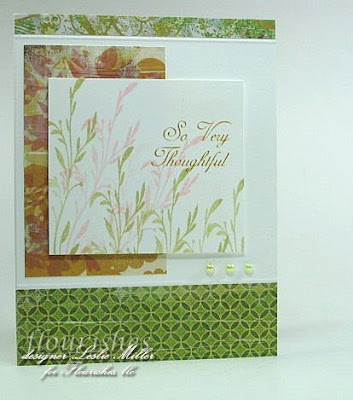
I love this foliage image from the Summer Blossoms set. I stamped it twice in pink, and a few times in green, added a sentiment, and my main image was done. By doing the pink first, I didn't even have to clean the stamp between colors. I just stamped it off a few times and went straight to the green. The BasicGrey Perhaps designer paper (one of my favorite collections) helped determine my colors. Plenty of white kept it sweet and summery looking.


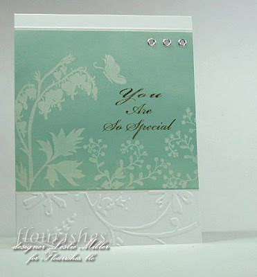
You may notice this next card uses the same basic layout as the first card but, rather than designer paper, I did a little Cuttlebug embossing and replaced the entire center with the stamped panel. I used the Versamark resist technique, which I love for the ethereal, dreamy, soft and lovely quality of the image. It gives a card a very special look with very little bother.


To accomplish Versamark resist, you need only the most fundamental supplies:


  • Your choice of solid image stamps (I used images from Spring Ephemerals)

  • Glossy cardstock

  • Versamark stamp pad

  • Regular dye-based ink

  • Wadded facial tissue (bathroom tissue...TP)


Stamp your solid images on the glossy cardstock with Versamark ink. The images will be clear, but you'll be able to see where you stamped them. Glossy cardstock is slippery, so hold the paper firmly as you lift the stamp, and do your best to avoid slippage. Let the ink set for a few moments -- no worries about it drying out. Use the wadded TP to take up ink from the dye-based ink pad and simply rub it over the panel and watch the image emerge. You can also use a brayer to apply the ink if desired. A spectrum pad gives a very nice effect, too. Or, experiment with blending different areas of color with the wadded TP or brayer. Today I used just one color for simplicity. The sentiment from Many Sentiments, stamped in Palette Umber, finished off the panel.


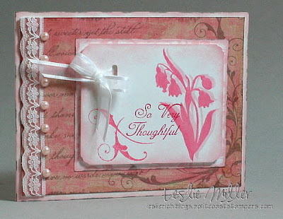
I'll finish up here with just a few more quick samples of ideas for solid image stamps... On this card I stamped the image, then stamped it again slightly offset, without reinking, to create a shadow:


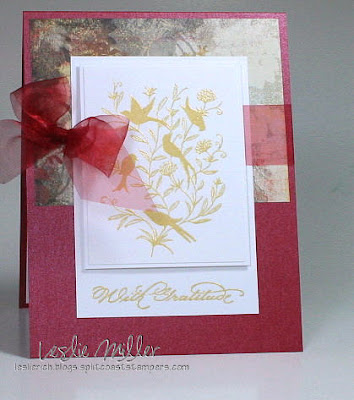
An embossed image gives an elegant result:


I stamped this solid image from Thinking of You in Palette Cognac (waterproof) and colored it very simply with regular Stampin' Up! water-based markers. No special shading...just very simple coloring. Really...not the least bit difficult, and not even very time consuming, but it gives the opposite impression:


Pretty fun stuff! I know you'll enjoy seeing more samples, so take a peek at what the rest of the team is sharing today:


I'm so glad we could have this visit. Now, let's go stamp something!

Wednesday, June 24, 2009

Copic Coloring in 10 minutes!


Copics are the premier art marker and all the rage for paper crafters and Flourishes is happy to provide you with our unique groupings - colors specially selected for their natural color blends.


If you are new to copics and want a little tutorial, we’ve developed this quick ten minute video to show you how I colored this image - using some simple techniques to get you started. In it we’ve used colors from the Sky Collection and the Poppy Collection.


Stamps: Flourishes All Wrapped Up; Ink: Palette Noir, Copic: Sky Collection and Poppy Collection; Paper: Flourishes Classic White Cardstock, Basic Gray Euphoria, SU; Embellishments: Light Blue Rhinestones, Flourishes Finishing Touches - Beautiful Brads, Blue Silk Ribbon

Here is the link to the video:

Copics in 10 Minutes


Did you notice the embellishment on the bottom of the card? This was created taking one piece from Flourishes Finishing Touches – Beautiful Brads collection and pairing it up with our light blue rhinestones for a perfect accessory!


Please check back tomorrow when the fabulous Flourishes Design Team will show you what they've been working on and Saturday, Jan Marie will have another great article on copics!


Thanks for stopping by!


Getting to Know Copics

The introduction of the Flourishes Collection has presented to many of you some questions that have been on your mind for a while. To that end, I will try to answer some of those questions about Copic Markers.
What is a natural color blend and why is this important?


To get the most out of Copic markers you should use a variety of shades to blend from light to dark for a realistic look. There are 310 different colors and with so many colors to choose from it's hard to know which to choose!


We've done the work for you! Flourishes created 20 different groups of markers in their natural color blend.
We offer a wide color range and the groups contain either 3, 4, or 5 markers. You will find the lightest to darkest in the select color range and intensity for each color group.


This does not mean that you will not add in a little extra here and there for highlights, but by sticking with these color groups until you have become Copic savvy you will have success.

Why did Flourishes decided to make Copics available in this manner?


Some stores sell Copics individually and leave you to figure out what are the natural blends. Others sell Copics in groups of 12 markers - with NO guarantee that you'll get a natural color blend group, and you may get colors you'll never use! Other stores require you to make a 6 month commitment - very expensive and you may never use them all! Still others continue to match them to a paper group.


A lot of thought and research and attending Copic certification classes led me to believe that the problem for most stampers was the way that Copics were marketed.


Why are Copics so expensive and do you think they will go down in price?

Copics are an artist quality medium. These markers have been on the market for 25 years and the formulations have not changed. These markers are refillable and the tips can be changed, but probably will never require you to do so. Considering that they are a lifetime investment I do not think they will go down in their price. The markers speak for themselves.


Flourishes choose to carry the Sketch markers for two basic reasons:

1- There are 310 colors available in Sketch, more that in any other style.

2- They hold the most ink in the chamber, requiring less refilling. Ciao markers sell for less but hold much less ink requiring more refilling and have less colors available.


What important things do I need to know about my new Copics?
By choosing Copics in the Flourishes Copic Collection you have already made the best choice. A few tips about your markers and you will be ready for my next post on simple coloring techniques.


Let's look at the markers.


Here I have a marker closed and open. You will notice that the oval "can't roll" styling makes the stay in one place. They are clearly engraved as to the style and colors of markers.


The closed marker on the top has a grey stripe around the cap opening. This grey band denotes the brush tip of the marker, so that you can tell which end you are opening....COOL !

The open marker on the bottom again shows the grey marking at the brush tip of the marker. The rest of the marker is the same color and the opposite end of the marker is a chisel end marker. Both of the tips are virtually indestructible.


Copics do not require any special direction in storing. I store mine in a case I obtained from Copic class and will share that with you on another day.

Can I blend one group of color groups with another?


Absolutely! Again, the more savvy you become - the more you will learn about blending. I will tackle this in another session, I don't want to overload you today! This is just an introduction of our groupings.


OK, I think you have convinced me to purchase my Copics from Flourishes, how do I determine which one to purchase first?


Flourishes' unique groupings allows you to select the natural blend groups that appeal to you and our groupings are small enough that the investment in minimal! So if you tend to use pinks and yellows, start with those groups. If blues and greens are more your style, we have several groups you will like!


Not only have we taken the time to put together these groups, but we'll also provide you with information on what we've learned about Copics! We'll let you know what those letters and numbers on the marker mean (yes they are important!), the type of paper that works well with Copics, and the Flourishes Design Team will dazzle you with incredible cards!


One last question Jan Marie. I have heard that the learning curve is hard and paper is very important , is that true?


Well in all truth and honesty, I have had a learning curve with every new medium I began learning to use. Just because I started out using Tombow or Stampin UP markers, did not make me a wiz at Copics. They are all different mediums and if you are like me, practice will make perfect. If we already knew how to do every aspect of art and most things in life, there would be nothing called learning!


Now on the subject of papers. Having sat through several of the Copic Certification classes with Marianne Walker, I know she has has some basic guidelines, but endorses no one paper exclusively. Again when FLLC started on this path, we knew that finding the best in our estimation for the products we carry was important. We want successes for our customers not customer service issues. To that end the search was long and intensive. We have worked directly with a very large paper company, and they were so helpful. They learned about the needs of stampers along the way as well. The bottom line, we think we have made an excellent choice. The whiteness of the white is a very bright white. The ivory is a beautiful buff. The paper is absorbent but does not suck up the ink. Being alcohol based inks, these are actually absorbed into the paper, rather than sitting on the top of the paper. Our paper is environmentally friendly, it is not a coated paper. I think you will find it a great paper for many of your projects, but it may not be a one paper fits all of your needs paper.


Thanks for joing me and Getting to Know Copics.


Ciao


Monday, June 22, 2009

Flourishes Timeless Tuesday Challenge(FTTC21)!!!

It is time for Flourishes Timeless Tuesday Challenge(FTTC21)!!!! Thanks so much to all of you who participated in last week's inspiration challenge. Keep reading to find out who won!

The Friends of Flourishes blog design team are bringing you exciting and different challenges each week. Everyone can PLAY and anyone can WIN! Make sure you continue reading to find out how.

This week Silke Ledlow is hosting. Silke is challenging us to a sketch she has designed.


As far as sketches go, there is not much explanation necessary. You can turn it and enlarge the sections to fit your card size. However, in the end, it should still look like the sketch. Good Luck!!!! Looking forward to seeing what you create with it!!!


Let's go see what the blog design team created using this sketch!!!


Up first this week is our challenge host, Silke Ledlow . Silke is using the Sweet Peas and Many Sentiments stamp sets. Silke is using the newly released Flourishes Copic Color Collections. She colored the sweet peas using the Hollyhock and Fields color collections. Wonderful coloring, Silke. Love the beautiful shades of pinks and greens with the warm golden dp frame detailing. Beautifully done, Silke!!!


Next, is Betty Wright. I am using the Nasturtiums stamp set. I used the large image to create a background. I stamped one of the smaller images along with the sentiment to create my framed focal piece. I am using the newly released Flourishes Copic Color Collections. I colored my background and focal images with the Tiger Lily, Dusty Rose, Poppy, and Spring Greens collections. I used the Cool Neutral collection to create shadow.


Cindy Haffner is next. Cindy is using the newly released Life, Love and Lemons stamp set. I love how Cindy is using the sentiment as the focal image and one of the slices as an accent. The layered inverted square Spellbinders is a terrific look to the framed spellbinders card framing. Great colors and sparkly dp choice!! Wonderful detailing, patterns, and design, Cindy!!!


Next up this week is Connie McCotter. Connie is using the Summer on the Patio set. This is a wonderful set with so many images to create lovely summer patio scenes. Connie is using some some beautiful basicgray wisteria designer paper to accent the image scene for her card card. I love these colors and patterns. She added some ribbon and hardware detailing. She finished with pearl accents. Lovely card, Connie!!!


Up next is Dee Jackson. Dee is using the newly released Waterlilies set. Dee is also using some of the newly released Flourishes Classic White and Classic Ivory cardstocks. You have to get a pack of each and just try it for yourself. This cardstock is fabulous and wonderful with copics. Speaking of copics!!! Dee is also using the newly released Flourishes Copic Color Collections. She is using the Tea Rose, Dusty Rose, Hollyhock, and Fields color collections. Beautifully colored, Dee!!! Gorgeous card!!!


Last this week is Kimberly Crawford. Kimberly is using one of the newly released sets called Patriotism on Parade. Wonderful coloring and cut work detailing, Kim. I love the wrapped twine detailing. Wonderful Patriotic card!!! Please check out the Designing for a Cause Challenge to see how you can help with the Wounded Warrior Project and Cards for Heroes.


Be sure to check out each designers blog links to get more detail card information!


Flourishes Timeless Tuesday Winner(FTTC20)

decided by
Random Integer Generator
Here are your random numbers:24
Timestamp: 2009-06-23 03:23:45 UTC


Anita Hovey You Won!!! Congratulations!!! You need to email: flourishesllccustomerservice@cox.net for your coupon code!!!!


By the way, if you still do not have theTimeless Tuesday blog button for your blog, check here for the codes.


Now, it is your turn to play! Here is what you need to know!


  • Anyone can play whether you have Flourishes stamps or not. Of course, if you have Flourishes stamps, by all means, use them.

  • Use code word FTTC21 when linking to SCS or public gallery. Leave a comment on this post with a link to your creation. Please give a direct link to your blog post so we can see the Flourishes challenge post and not just the generic page. To get the full link, click to read the comments. Another page will open that will have just the one card and your comments. Copy and paste that link here in the comments section.

  • If you use either your blog link or online gallery, please give an active Flourishes Newsletter link.

  • You can combine this challenge with as many others as you want.

  • The challenge runs from Tuesday, 12:01 am until Monday at 8 pm EST

  • Enjoy yourself!!!

We cannot wait to see what you create!

As always, thanks so much for stopping by!

Your Flourishes Friends!

A Match Made in Heaven!

More than a month after our announcement that Flourishes would be adding Copic Markers- we are happy to report - each and every collection is now in the store!

When we started to put together the names and colors in each of our Copic Collection Natural Blending Families, we knew that we really needed the perfect paper to serve as our canvas for these wonderful markers. We searched high and low and tested paper after paper until one day, in a place we least expected to find the paper of our dreams - we found it! It was a match made in heaven!

Introducing.....

We will now carry this fabulous paper in Classic White and Classic Ivory. Both are 100 pound cover weight paper (270 gsm - grams per square meter) offering a wonderful weight for either layering or as your card base!

The Classic White offers an extraordinarily bright white surface - the brightest white we found - and smooth finish to help deliver rich, vibrant colors and sharp images with startling results. This hand-picked paper blends your Copic markers like no other card stock and won't dull or gray your colors like other papers. This is truly the best paper for Copics that we have found in the marketplace (and we've tried them all!). As you'll see in the store, you'll be able to pick up 25 sheets for just $4.99.

While the standard that we placed on this paper was to work with Copics, we are sure that you will find many other uses for this wonderful paper as well. Our design team tested it to the max and also found fabulous results with colored pencils and odorless mineral spirits as well as watercolor pencils. We know you'll have fun taking this fabulous paper for a "test drive!"

Since it has been awhile since we first announced our Copic Collection was coming, we wanted to showcase each of the collections again for you to peruse!


Aren't those colors delicious? Coming up Wednesday, right here on the Flourishes Newsletter, we'll give you a little insight into how we came up with each of our natural blending families. And, Thursday we'll follow it all up with some basic coloring lessons. Bottom line, we love the way these colors blend and we know, given the right knowledge, you'll have beautiful results too!

~The 'Flourishes'