Thursday, February 26, 2009

Flourishes Focus; Colouring with Twinkling H20's

Hello my Flourishing Friends! It's Laura, and in keeping with this month's focus on colour, I thought I would share what I've discovered using my newest fave...Twinkling H20's. Now, what's ironic is I have only had these little babies for all of 2 months, and while I really think they're fabulous, I haven't had a chance to explore all the possibilities with them. So what I thought was best, was to position this tutorial for the beginner colourer or watercolourer, because I do think there are some fabulous features that make them very appealing for the novice.


Here's what you'll need to get started:
Outline stamps...I chose I Love Roses
Versamark
Detail embossing powder
Twinkling H20's
Aqua painter
Watercolour paper


First, emboss your image. I find that embossing really helps control water bleed, and makes it easier to "stay in the lines".
Plus it looks really pretty!


With my aqua painter, I squeeze out a drop of water into each little pot of your Twinkling H20's.
This softens the paint and makes it easier to pick up the colour.


As I pull colour from the pot, I blot it off on an old Pringles lid. The colour is highly pigmented and intense, so right from the pot it can be too bright. This allows me to squeeze more water out and get the right colour and consistency.
Once I've pulled the colour from the little pot, I won't go back to the pot, I will pick up the colour from the little beads on the Pringles lid.


I begin by adding colour to my dry paper to where I believe it will be the darkest or most shadowy. while the colour is the most intense(dark). Here's what it looks like at that point. Then with a wet brush I begin to pull the colour away from the dark areas. Generally would do one area at a time, so it doesn't dry to fast, but for the picture, I did it all.

Twinkling H20's are quite forgiving. The blend easy, and if you get too much on, you can wet the area, and press a dry paper towel to it, and the paper towel will lift of much of the excess.


To finish, I like to create a wash of colour around the image, and to do that I wet the area around the image a small section at a time.

Then I outline the image with the Twink colour I want, then begin by pulling it out and away from the image in circular motions.


And this is the completed image.
Now I really tried to capture the shimmer, moving my camera and lighting around, but either I got glare from the embossing or a really harsh reflection instead of shimmer. That's really too bad, because it's so pretty in real life.

I will add as a final note, that as you add water and dilute the Twinks, you also water down the shimmer. So there is much more shimmer in the darker
areas.


Here is my finished card. I chose to work with Basic Grey's "Ambrosia" designer papers, and the layout is a sketch from Taylored Expressions TECC42. The three side panels feature the rose stamped in Tangerine Tango on Vanilla. I love repetition as a design element! (you can click on the picture for a larger image)

The photo corner I've had for years, I tied Tangerine Tango grosgrain ribbon along the lower portion. The sentiment is from "Signs of Spring", and it was the perfect size for the image and layout.

I hope you have found something to take away from this quick tutorial. Twinkling H20's are a fun and easy medium to colour with, and I've only shown one of the many things you can do with them. They are available in the Flourishes store, but leave some for me, so I can complete my set!
The rest of the design team has been colouring up a storm, so you'll enjoy stopping in at their blogs to see what shimmering creations they have to share:

Julie Koerber
Christine Okken
Cindy Lawrence
Faith Hofrichter
Latisha Yoast
Leslie Miller
Stacy Morgan
Jan Marie Caruso

Have a fabulous weekend and thanks for dropping in to see what we've been up to!

Wednesday, February 25, 2009

Stamper's Dream Weekend-Day Two

It's day two and I am the facilitator for the day. It is going to be a jamed packed day! My approach for teaching this class was different. I was going to teach them, their design uses as well as the their use of design elements in definine themselves in each and every project. I was going to teach the Who, the What that makes each of them a distinct designer we want to emulate and learn from in our own artistic journey.

I asked 4 designers to create a project for me that I could used on this day and the stampers to complete in 30 minutes or less. They were asked to use the Signs of Spring and anything that we carried in Flourishes. Their projects are dazzling!


The four designers are :

Julie Koerber--Flourishes DT coordinator extraordinaire!

Laura Fredrickson, Latisha Yoast and Linda Duke.

Here are their creations:

Julie designed this very simple but adorable Chick It Out Box:

Laura's great card:


Latisha!


Linda Duke:


Whew! They are all so wonderful.


I addressed the elements of design on each project. The focal or entry point of the card as well as color, movement and unity. We also addressed the embellishment's. To top it off we discussed each artist, their designs and their signature points.


Those things ranged from Julie's wonderful creativeness, her organization and orderly instructions...all signature points that set her apart and gotten her to be a Rock Star and very published.


Laura always has a keen eye for color, scale and motion are things that set her apart and this came across in the two cards she designed. Her choice of designer papers that work in beautiful balance and scale with just the right scale of embellishment make her someone we all want to learn from as we grow artistically. She uses readily available things in an unsuspecting manner that makes one smile and experience the AH moment!


Latisha's fresh, clean and simple look is one that lends itself to other obvious stamp company images, BUT she has chosen to work with our timeless images and teach and share with us her keen eye for what is always the just enough, but never too much--to keep that young and fresh look that may so often be missed by many good stampers that go for the obvious image styles. This sets her light years apart from the others in a good simple clean and fresh way....her use of natural craft paper, dotted ribbons, linen or thread or her ever present buttons make he stand apart as well.


My most scary undertaking teaching was my dear friend Linda Duke. She has long been my secret mentor. I study her creations when I can and do so in depth. This lady always has perfection, beauty that ooze from her work. She is a queen to the technique of layering and perfect embellishments. For this card she did a woven background piece which I knew was just not practical for the class, so I improvised...I created a soon to be released basket weave 4 x 4 background to create the image. This was one of the free stamps that each attendee received.


In each of the projects the stampers received the special pointers to create in the mindset of each of these wonderful stampers. The last part of the class was a 2 1/2 hour class taught by none other than Marianne Walker of Copic. She took the elements of design and elaborated on all of the points that I had covered. We learned about emotions and color as well as the basic aspects of the use of colors. It all went so fast. We could have stayed for more, but supper was calling...so next time Marianne we will expect to learn even more.


We finished off Sunday by a gathering of the Stampers Dream Weekend participants joined by the Copic class for a supper to savor good food, good friends and lots and lots of getting to know you better. We dined on a typical Mardi Gras menu with Chicken and Sausage Gumbo, Red Beans and Rice. Dessert was Doberge cake and King's Cake both specialties I bought back from New Orleans ...the theme was definitely Laissez le bonnee temp rouler!


Viola...Day two was gone, the Stampers Dream weekend retreat was over---but will not be forgotten. We made such wonderful new friends, and enjoyed our friends we know thru email and Flourishes. It was a delight for the three Flourishes to share our Atelier, great teachers and food. Our greatest thanks to one and all!


Ciao,


Tuesday, February 24, 2009

Stampers Dream Weekend-Faith & Becca


Welcome inside the Atelier at Flourishes...we're just setting up for the first Stamper's Dream Weekend. Take a peek at the table and chairs as we set up.


It's was Saturday and we were ready at Flourishes to welcome the 17 lucky stampers that attended. Here's how we looked just ready to say hello! This is a picture of the filled goody bags for the first day of class.


After some time to chat and have morning coffee we settled into our very full first day.


First up was Faith. We stretched her limits showing that even Faith could teach a simple--well simple by Faith's standards-- card. Here is the morning star at her intro to the class.


We all made three cards....two that took us right to the point of making our own Faith "Dotty" signature cards...she even taught us her signature of perfectly lining up the dots.


Look at our finished Faith cards. She was great to share this technique with us.

After our beautiful and delicious ladies luncheon, Becca Feeken took the stage to groom us in her elegant and very stylish feminine cards.
Again we made three just luscious cards...but some will have to wait to be seen as we used the soon to be released March sets. Here is a look at a very proud stamper and her Becca card.


Viola! That is the smile of pure satisfaction, wouldn't you say? Tomorrow we'll feature the Sunday session and our Copic certification class.

Thanks for looking inside at our Saturday session.

Ciao,

Monday, February 23, 2009

Timeless Tuesday!

It is time for Flourishes Timeless Tuesday Challenge!!!! Thanks so much to all of you who played along with us last week and used flowers on your card. We had quite a few beautiful cards to look at. Great work everyone!!! Keep reading to find out the winner from last week's challenge.

For those of you who are new to the site, the Friends of Flourishes blog team are bringing you exciting and different challenges each week. Everyone can PLAY and anyone can WIN! Make sure you continue reading to find out how.

This week Silke Ledlow is hosting the Timeless Tuesday Challenge. She wants us to use vellum on our cards. There are all types of vellums. You have vellum cardstock, vellum paper, colored vellum, embossed vellum, printed vellum, and all kinds of vellum stickers and embellishments. In addition, there are many techniques that can be done using vellum. So, the challenge this week is to dust off your vellum stash and do something with it!!!!

Let’s go see the many different ways the blog team has used vellum.


Up first is our challenge host Silke Ledlow . She is using the Flourishes Thank You set in shades of purples. She has used vellum in two places on her card. The first is a background layer behind the flower. It is used to soften the designer paper and create visual interest. Her other use of vellum is the border punch. This is fabulous and the gem detailing is just perfection. Love how she colored the flower so beautifully, too!!!!


Next is Betty Wright. I am using the Flourishes Summer Botanicals and Many Sentiment sets. I am using some altered Basic Gray Urban Prairie dp found at the Flourishes store. I stamped and sponged each piece to create a more vintage feel. I love the solid coneflower image. I think it looks just as beautiful in colors as it does in silhouette. I used a vellum overlay sentiment tag!


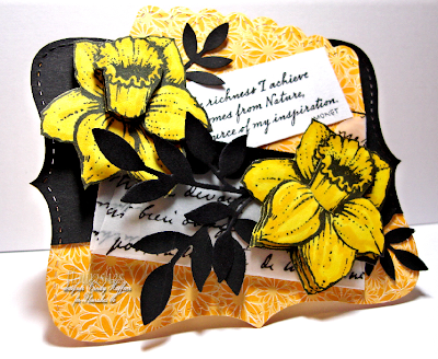
Next is Cindy Haffner's . Her card uses uses the Flourishes February release Signs of Spring set. Cindy is using a scripted printed vellum envelop to create this boldly colored card which she accessorized beautifully with the tole daffodil flowers. The wonderfully colored flowers are so striking and dimensional. The little black die cut leaves just compliements the daffodils beautifully, too. Love how she included the Monet quote as the finishing touch!!!!!


Last up is Kimberly Crawford. She is using the Many Sentiments set to create this bold beautiful card. I love the Basic Gray, Sultry dp found at Flourishes I love the bold colored patterns and her wonderful stitched border. She used vellum cardstock to die cut the lovely butterflies. Love how she stamped the sentiment directly to the colored dp. She finished her card with just the perfect complimenting touches of organdy ribbon, and gem detailing. Great looking card!!!!


Be sure to check out each designer's blog links for more specific card details.

Becca and Dee could not be with us this week because they are in Florida finishing up a fabulous Flourishes Weekend Craft retreat with Copic class. I cannot wait to see photos of what they all did and learned these past few days!!!


Timeless Tuesday Winner(FTTC3)!!!!!

Random Integer Generator Here are your random numbers:12

Timestamp: 2009-02-23 23:39:45 UTC

Rachel( Rachel V) Congratulations!!!!!

Rachel, email: flourishesllccustomerservice@cox.net and they will send you the gift card code!!!!
Just want to remind you all that when we started these challenges a few weeks ago we mentioned something about a monthly drawing. Well, everyone still has a chance to win. I will combine all comments with card links in order into a monthly drawing and have Random.org choose a monthly winner, too. So what does that mean to you? It means that any past challenges for the month you can still enter. The more you enter cards the better your chances. Also, it is very important to link back to the actual challenge comment section for Flourishes Timeless Tuesday. So, with Flourishes Timeless Tuesday Challenges you have more chances to WIN!!!!!

By the way, if you still do not have our lovely Timeless Tuesday blog button for your blog, check here for the codes.

Now, it is your turn to play in our challenge!!!!
Here are the Rules!!!!

  • Anyone can play whether you have Flourishes stamps or not. Of course, if you have Flourishes stamps, by all means, use them.
  • Use code word FTTC4 when linking to SCS or public gallery.
  • Leave a comment on this post with a link to your creation. Please give a direct link to your blog post so we can see the the Flourishes challenge post and not just the generic page. To get the full link, click to read the comments. Another page will open that will have just the one card and your comments. Copy and paste that link here in the comments section.
  • If you use either your blog link or online gallery, please give an active Flourishes Newsletter link.
  • You can combine this challenge with as many others as you want.
  • The deadline to win is Monday at 5 pm EST.
  • Enjoy yourself!!!
  • Make sure you post your card link back here to the Flourishes Newsletter and use the code FTTC4 if you load your card to SCS or another gallery.


We cannot wait to see what you create!!!! As always, thanks so much for stopping by!!!!

Your Flourishes Friends!!!

Want this blinkie?

blinkie 5


Well, all you need to do to get your hands on this blinkie is show us your fabulous Flourishes creations! We'll be scouting for talent and when we find it, we'd like to feature your work on our blog! Know someone who really makes Flourishes shine? Just email us at flourishesllc@cox.net with Limelight in the subject line. We'll be sure to check that person out and who knows, that stamper just might be the next fabulous designer that is in the..... LIMELIGHT!

In The Limelight......

Every now and then I grab a cup of coffee, fire up the computer and just take some time to be inspired by the work in the Flourishes gallery over on Splitcoast. I love taking this time because I am always, always inspired!

The other day, I had my java in hand and right there on the first page was the work of one talented cookie! I wondered if I had been asleep at the wheel NOT to notice Barbara Anders fabulous cards before. So, I traipsed over to her blog and saw some more Flourishes creations and they were all as pretty as the first!

Want to see?
Barbara did this card using the new Signs of Spring set using one of the SCS sketches. I would never have thought to use black and yellow together but doesn't it just -- in this case -- exude elegance? This is just such a striking card!

Speaking of striking, I was taken by Barbara's use of glitter on the bird from the All That Glitters set. She really made this one sparkle and shine!
How simply sophisticated is this card? Using the Rejoice set, take some gold embossing powder and just add splashes of color with the holly and berries. Before you know it, you have a beautiful Christmas card that you can easily mass produce! I might have to CASE Barbara next year because I am really loving this card!

And last but not least, I loved her card using the floral element from the Thinking Of You set! It is feminine and warm for a time when you really just want to stuff a hug in an envelope. The hues of blue are just calming.

Thanks Barbara for sharing your talent with all of us!

I hope you enjoyed this "limelight" moment! You never know when I might decide to take a coffee break looking for inspiration - so keep all of those fabulous creations coming! And, don't forget to use the keyword FLLC so that we can see your work in the Flourishes gallery over on Splitcoast!

Tomorrow the Friends of Flourishes team has another Timeless Tuesday brewing, so be sure to stop back for a fun-filled challenge!
See you back here soon!
~Julie

Friday, February 20, 2009

Flourishes Focus!

Hi all! It's hard to believe it's Friday already. But, with it comes another Flourishes Focus and another excuse to share with you some of our favorites with a Flourishes flair! It's Julie Koerber here! And today.... I bring you one of my favorite ways to color - Colored Pencils!


I remember one day my mother-in-law brought home some samples from a colored pencil class that she had taken at her local stamp store and I was wowed! I'd never seen anything like this and coloring? Well, I haven't given it up since I started in Kindergarten. Why stop now? The colors in my MIL's creations were vibrant - like nothing I had seen in stamping before. I asked to borrow her instructions from class so I could play in my stamp room. I've been reaching for my colored pencils ever since! I hope after taking this walk with me through my creations, you want to dabble in this medium too!

What you need to get started

  • Quick dry, non-smear, permanent inks. I used Palette inks for my creations. I also used Versamark with embossing powder as well.
  • A paper with "tooth". Papers that are ultra smooth really don't work well with this technique. You need something for the waxy colored pencils to grab on to - a bit of grain to hold the pigment.
  • Prismacolor or Koh-i-noor pencils ~ both of these pencils are waxed based and will blend well. Both are unparalleled in what kind of color they can deliver!
  • Odorless Mineral Spirits (optional and only used on the last creation) and a blending stump.
  • Good art eraser (white plastic eraser--make sure it's clean each time you use it!)
  • A good quality sharpener to keep your pencil points sharp.
  • Your favorite Flourishes stamps!

Creation #1: Using colored pencils on dark cardstock

When I saw the peacock in the newly released Strut Your Stuff set, I just knew that it needed to be colored up in a bold, artsy way. This is where colored pencils really shine!

I started by stamping my image with Versamark ink and embossing with copper detail embossing powder. Then, I went over the entire image with bleach. I wanted to make sure that my colors really stood out! Edited to Add: to add the bleach, I simply "painted" it on with a fine tip brush. Make sure if you like the brush to wash it out immediately or the bleach will eat the bristles!
Then, I added white pencil where I wanted white or lighter highlights to peek through on the peacock's body and in the feathers...
After that, I added Chartreuse over the entire base of my feathers and True Blue Prismacolor Pencils over the entire body of the peacock. From there, I added a bit of Light Aqua to a few spaces in the feathers. I wasn't going for a realistic look here - I wanted an "artsy" feel that featured swirls of color in the feathers.
Next, I went over all of my feathers with my Chartreuse green to blend all of the colors a bit. TIP: If you don't want to use Odorless Mineral Spirits to blend your colors as you add them, you can actually go over the entire piece with either a lighter color pencil or a blender pencil. Next, I added Ultramarine to the peacock feather spots. Once you have your coloring right where you want it, it is a good idea to "seal" your work. I use what is called a Workable Fixatif by Krylon. Why use a sealer? It helps to bring a bit of a sheen to your work and preserves it. Because you are using pencils that are a wax base, they can produce what is called "wax bloom" over time. It's a milky white film that can form on the top of your creation. I don't know about you, but if I take the time to color my card, I don't want this white film to form on my card sometime down the road! The only advice I would have when using this spray is to make sure you are in a well ventilated area. It is a kind of lacquer and it's not good for your lungs I am sure!

Here's another look at the finished card...

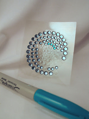
See the bit of "bling" on the curls of the feathers? I have a fun story about those. I used THESE rhinestones and knew they wouldn't be bright enough for my creation, so I pulled out my turquoise Sharpie and changed the look of my bling in seconds!
You can see through the the steps of coloring the peacock that I layered the color and added darker shades over top of light.

I hope you found this tutorial helpful! The rest of the Flourishes DT picked up their colored pencils as well for this edition of the Flourishes Focus, so be sure to hop on over to their blogs to see their fabulous creations!

Christine Okken
Cindy Lawrence
Faith Hofrichter
Latisha Yoast
Laura Fredrickson
Leslie Miller

For more cards using this technique and a second tutorial on other ways to use colored pencils, be sure to stop by my blog HERE.

STOP THE PRESSES! Jan Marie is headed to New Orleans as we speak to learn and play, so she asked me to showcase some of her colored pencil creations! She didn't reach for peacocks or even flowers for her cards, she decided to pick up her Rock-A-Bye set for some sweet-as-can-be baby creations -- one fit for a boy and one for a girl! Aren't they darling?


She used Prismacolor Pencils and actually reached for her colorless blender pencil to meld the layers together and blend! I love how she used her Nesties and a Spellbinders Frame to really give her cards some extra pizazz!

Thanks for stopping by! See you back here soon!

~Julie

Thursday, February 19, 2009

You've got to act fast!

Looking through the comments under the Sophie Special, we had a comment from a nice woman who tried to order the special and couldn't find it in our store. After checking into this, I discovered -- We sold out! The good news is, Sophie will be back on the 1st of March with some more fab finds paired together for YOU at a price that makes you want to snatch it up!

Stay tuned folks - Flourishes Focus is coming your way soon and this one will have you seeing color in a whole new way!

~Julie

Wednesday, February 18, 2009

Sophie is at it again!!!


Hi all! I am posting for Miss Sophie today! She actually called me in a tizzy! The gals are busy getting ready for their big stamping weekend in Pensacola and the computer has been tied up at home base.

When she called she didn't even say hello! She said, "Can you help a gal out???" I cracked up. "Soph, is that you???" We just started laughing! You might notice that she's a bit late this month. Well, the "Flourishes" are "breaking her in" so to speak with all types of stuff and she hasn't had time to really be our personal shopper! She is learning the business though! ;-)

So, she gave me the low down on her latest picks and asked me to share the wealth with you! She was jazzed about her latest finds. Blue is a favorite color of hers!

Here's a peek at the next special!

She's gathered up paper, ribbons, rhinestones, and ink and Flourishes is offering the package at a 15% savings to you! You will get one package of Basic Grey 6 x 6 LilyKate Paper, one package of Ice Blue Rhinestones, 5 yards each of Ivory Scallop ribbon, Lemon Yellow Sheer ribbon, Light Blue Polka Dot ribbon, and one Ballet Blue Palette ink pad and refill. All this for only $24.35, a savings of 15% if you were to purchase these items separately. Sales ends February 28!

Well, hope you love her latest finds! She claims she'd love to wallpaper a room with that Lily Kate paper -- who knows --before long the warehouse could be bathed in paisley!! ;-)

Click HERE to shop!

Happy Wednesday!

~Julie

The fun you might have missed!

Back in January, Etha over on SCS organized an ATC swap for Flourishes in the company forum. I have to admit, I jumped in without even thinking about the fact that I don't really make ATCs!! Well, I am glad I did. It stretched me creatively and I got these BEAUTIFUL creations. I was stunned in fact! It did give me some fabulous inspiration to sock away for the future--- don't you think???

We wanted to showcase some of this talent so that when we have a swap over in the forum -- you might want to jump in like I did and take part! It was a blast!

Take a peek at these beauties by (Lto R) Sharon Doolittle , who used the new Signs of Spring set and Cathy Rose, who picked up her Lilac set!

These next two are by Etha Schuette , who took the Spring Ephemerals set in an artsy direction with Gesso and Carol Southern who created this gorgeous white washed rose from the I Love Roses set! 0000OOOooo!
Next up is Ali Manning who created a gorgeous shattered glass effect with the Poppy Patch set and and Nancy Kirk , who cooked up a beautifully colored rose with a beautiful Damask background-- gorgeous!!!

These two with a springtime flair - one by Teresa Gray who created a gorgeous and sparkly tulip from the Stamp Simply Thank You set and Latisha Yoast who used her Summer on the Patio set to create this perky flower filled vase!!

And lastly, here was my creation - I used the Spring Ephemerals set with the Fantasy Floral set for the sentiment. I just love the Forget-me-nots because of how many fun ways you can use this stamp as both a focal and a filler!

All of us at Flourishes had a blast seeing these stampers' fabulous work up close and personal. Not to mention, we got to see some fabulous stamp sets used in new and different ways! Thanks Etha for organizing this! Can't wait until the next big swap!!